Product
Talent Intelligence 2.0
One intake → an analyst-grade report across three views, guidance woven into every section.
For the best experience we recommend a larger screen. Some animations and interactions may not run as smoothly on mobile.
Everything came down to one question:
Can we actually hire this role at this price in
this market?
Make a sceptic trust a number they didn't calculate. I designed the product, the system underneath it, and the rules that let an AI build the rest without breaking either.
Can we hire a Sr. Java Backend Engineer, in Bengaluru,at ₹18 lakhs?
One intake → an analyst-grade report across three views, guidance woven into every section.
Free preview earns trust, then the user subscribes for full reports. Designed end to end, with publish as the conversion point.
Salaries read as ₹ CTC, not base pay, and the benchmarks come from GCC hiring across these four cities.
The free report had to earn the subscription, and even when it did, the flow ended with no next move.
A CHRO, a hiring manager and a talent manager each hand-assemble fragmented data to answer one sharp question.
answer the question, show the working, then tell them what to do about it.
Credibility is not abstract. It is three specific people, and each doubts something different. They come from the v1.0 UX brief, so the bars below start at assume.

Trusts a benchmark they can carry into a leadership meeting.

Trusts concrete supply data, no recruiter middleman.

Trusts trend lines, and scrutinises sources before believing them.
Experts don't trust what they can't check.
How I knowThe v1.0 brief has every persona asking where a number came from, and the India data has enough real gaps to justify the question.
Every number opens to show the inputs behind it.
One product answers three different questions.
How I knowThe brief maps one view per persona; the questions repeat.
Organised by question: three role-based views, one per persona.
Leaders decide fast, then defend the call later.
How I knowThe CHRO decides at board level: "carry it into a meeting."
Every section leads with the answer, plus a pinned action to take away.
Metrics were set before designing, so success was never a matter of taste.


What I tried, killed, and shipped, and the one reason that settled it.

The only one that stayed readable at density and quiet by default.
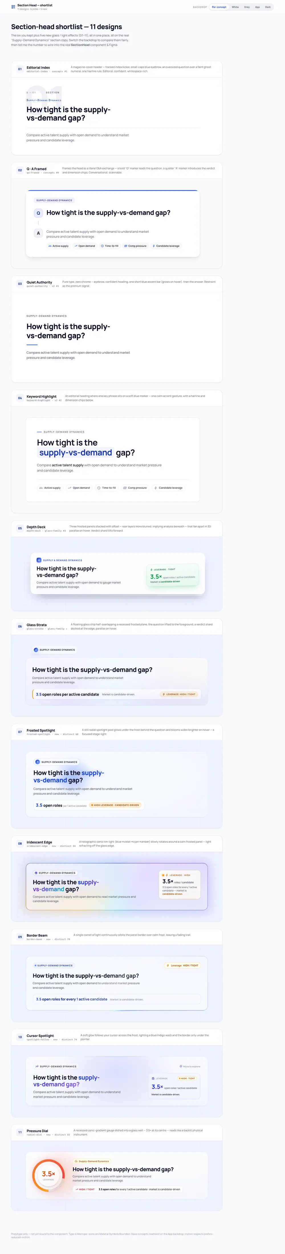
Carries the section's question as well as its name, so the report's logic reads at a glance.

Stays out of the way until you need it; owner-approved as the calmest.
Exploration was cheap; decisions were expensive.
v1.0 was the analyst's wall: eight dense tabs, with the feasibility score buried as one card among many. What shipped is three tabs, and every section heading is the question it answers.


More rebuilds


Here is what those decisions built. Read the real report below, then move a lever and watch the verdict recompute.


A product this size needed a system an AI could extend without drifting. 37 components, every value bound to a token, nowhere to hardcode.
Interactive components ship all seven. Display cards keep the three that can happen and mark the rest N/A, with a reason in the spec.
Every component clears an AA contrast floor and takes its ARIA from the spec. Nothing is signalled by colour alone.
No Code Connect on the Pro plan, so a plugin and a naming rule tie each frame to its .tsx + .md + .stories. Parity 36/37 as of 1 Aug 2026.
AI works, then stops uncommitted; I review, commit, and open the PR. Nothing touches main directly.
One colour change updates 6 tokens at once. Not every colour gets through.
Click a colour to repaint the system
Four numbers, four blanks. Every one of them waits on real traffic.
After launch · what moves each number off zero
Publish, with the funnel instrumented from day one: preview → subscribe → generate.
Take the three under-target metrics back into the design, then re-measure on real traffic.
Rework the report on what only real usage shows: activation, conversion, repeat visits.
No step of mine fills this one. It waits on the other three landing first.
The craft is verifiable today, and the usability targets now have numbers. The business ones still wait for real traffic.
Three things a model still cannot decide for you.
Holding 335 variables coherent while the surface keeps growing.
Spending colour on the one thing in the frame that has to be read first.
Catching a runaway edit before it reaches a hiring decision.

